A new year, a new decade and new year’s resolutions falling to the wayside already. That’s right, it’s January 2020 and we’re here to bring you some distraction from the month that never ends with our Graphic Design Trend Predictions for 2020 – Instagram style. We’ve rounded up 10 of what we consider to be some interesting and exciting new trends that we think are going to be coming soon, continuing or just making a comeback.
2019 was a year of unpredictability, change and innovation, with the creative world responding in turn in many weird and wonderful ways and we can expect even more for 2020 with the hope of a new decade before us. As graphic design reacts to the world we live in we’ve seen bold, bright and disruptive design, both eye-catching and brave, reaching out to an audience that is becoming more socially and politically aware by the day.
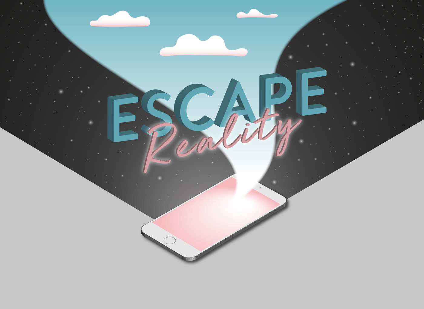
The same social change has also sparked an opposite desire for a more organic and human approach to design that is calming and that has a connection to the incresingly percarious natural world. This is further met with a more proactive use of graphic design to fight against climate change and for sustainability, using creativity to raise awareness and even funds. Contrastingly there’s also been a reach into the imagined world, with other-worldly 3D creations and futuristic neon lights lighting up an alternative escape from reality.
But it’s not all doom and gloom, in fact, design has a wonderful way of reaching out to us in hard times and inspiring us when we feel stuck. It can give us fun, innovative and clever graphics to make us think and laugh and realise that creatively we’re doing more amazing things and reaching out further than ever before.
As it’s 2020 and our lives are increasingly lived online, we’ve scoured the Instagram feeds all the world over to find some of the best creative examples of this years predicted trends to see how real artists are reacting to these trends in real time, and how the year before us could look. So enjoy our pick of the Artists of Instagram, and people to follow to keep up with the Graphic Design trends of years to come…
3D
Neon Colours
GIFs/Continuous Animation
Big Typography
Kinetic Typography
Organic
Disruption and Intrigue
Collage
Isometric Illustrations
Sustainable Action
3D
One of the best things about coming into the new decade is all the software innovation that’s coming with it. There has never been a better time to be alive for the evolution of 3D design, with creatives able to do more and do it better, allowing more interactive and attention-grabbing design that blurs the line between the screen, page and reality.
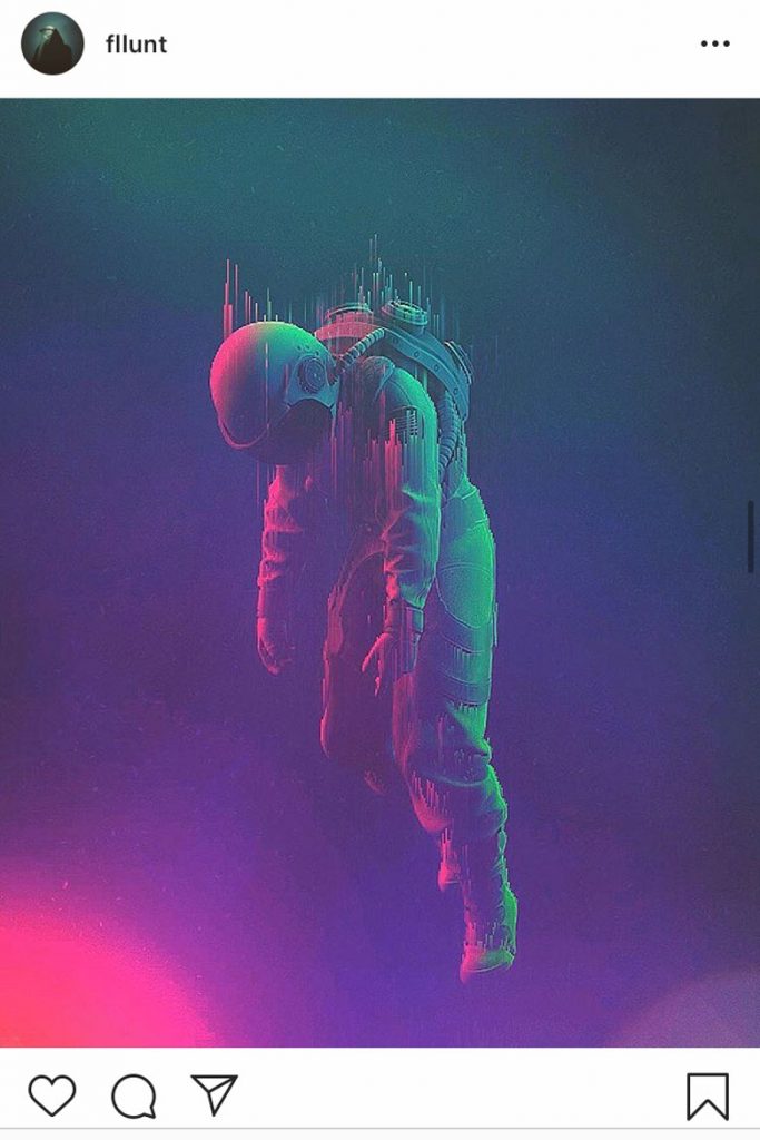
Instagram @fllunt
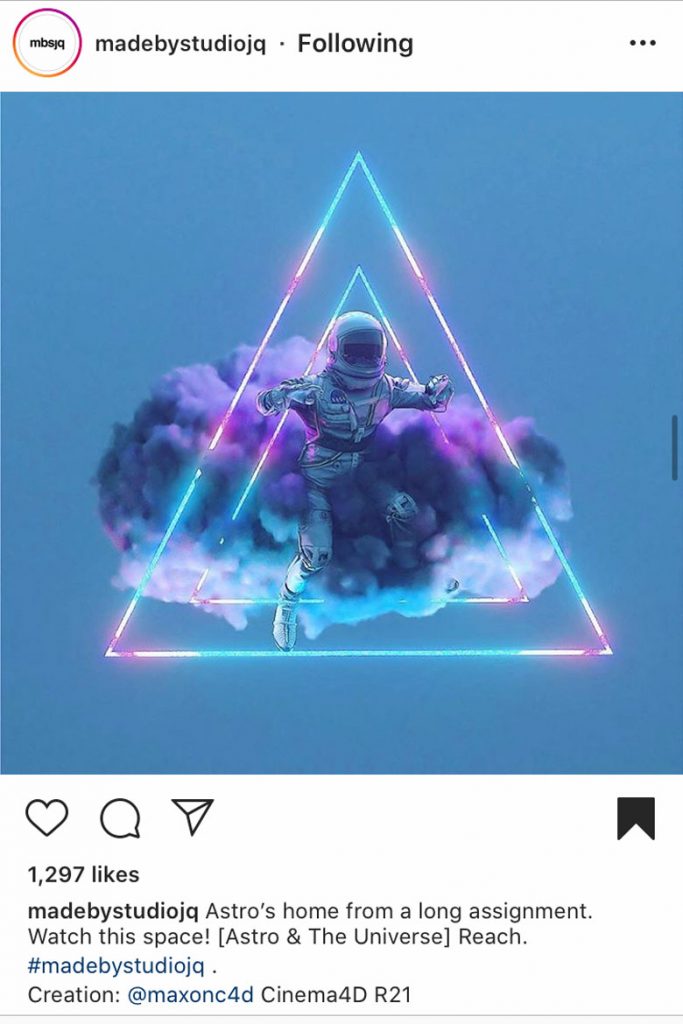
Instagram: @madebystudiojq
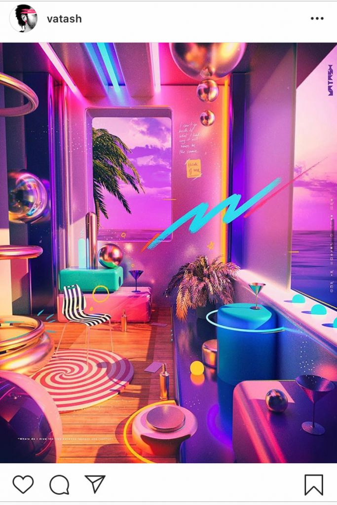
Instagram: @vatash
Often combined with neon colours and a reimagined reality, the world of 3D is a window to the world of the unknown. Artists such as Jon Quintin and Caleb Sanders combine astronaut figures with pink and blue neon hues, creating an ethereal vision of our future in an unchartered landscape, playing on our drive to know what’s out there with the negative space and lighting hinting at the unimaginable infinity of space, inciting a sense of mystery and wanderlust.
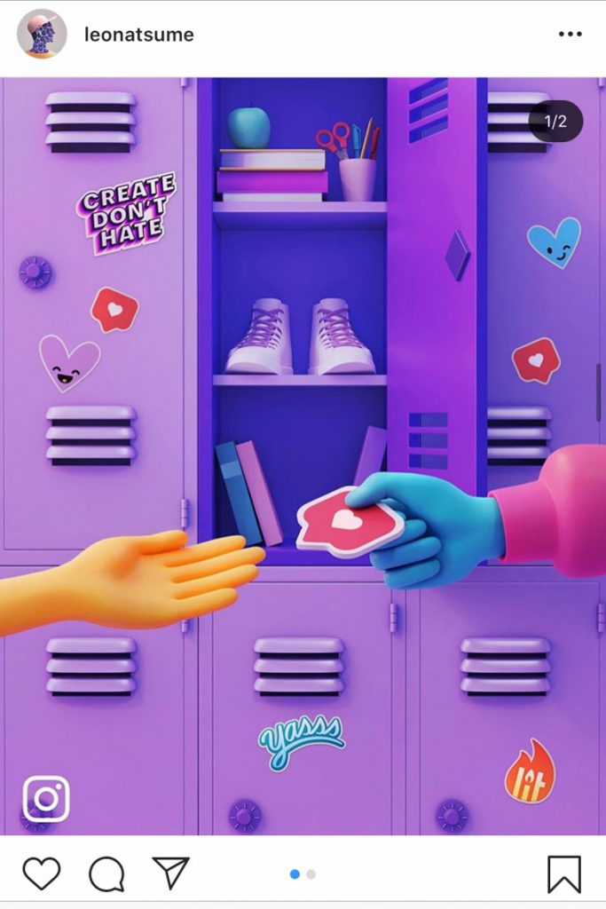
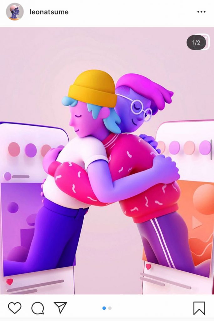
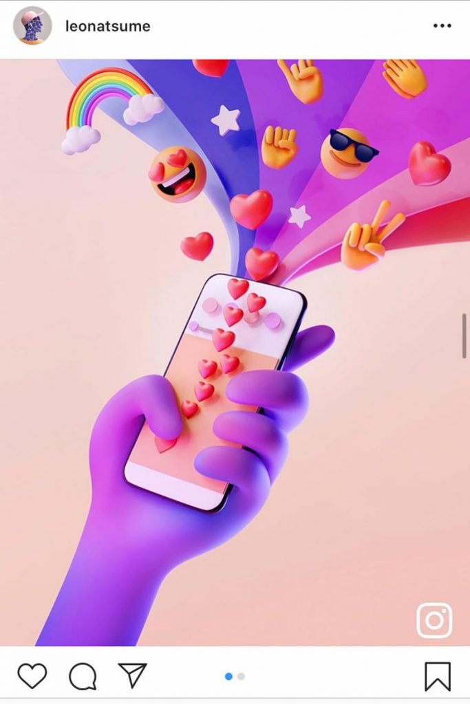
Big brands have also jumped on the three-dimensional bandwagon with Instagram commissioning artist Leo Natsume for their Anti-Bullying campaign with three posters featuring his 3D work. The barrier between screen and users melts away in the imagining of a world where screens become a window through which to connect and spread love not hate, epitomised by the pink and purple pastel hues and collection of cutesy emojis. As it is being distributed in schools all across the US schools and every Instagram office around the world, the world of 3D is coming to life through print, and the world of augmented reality is more tangible than ever before.
Instagram: @leonatsume
Instagram: @leonatsume
Instagram: @leonatsume
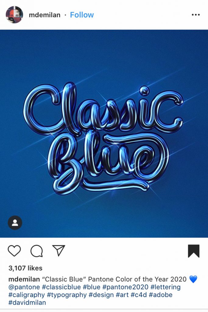
Neon Colours
A yearning for everything futuristic has come in strong and bright neon and fluorescent colours are the result. Often used in retro/futuristic crossovers it brightens up the often-black background with oversaturated colours and bold outlines. Neon and the fluorescent have also merged with a trend for liquid shapes, smooth and soft lines that seem create movement with their lack of hard edges, appearing modern with the neon glow giving it a surreal visionary effect.
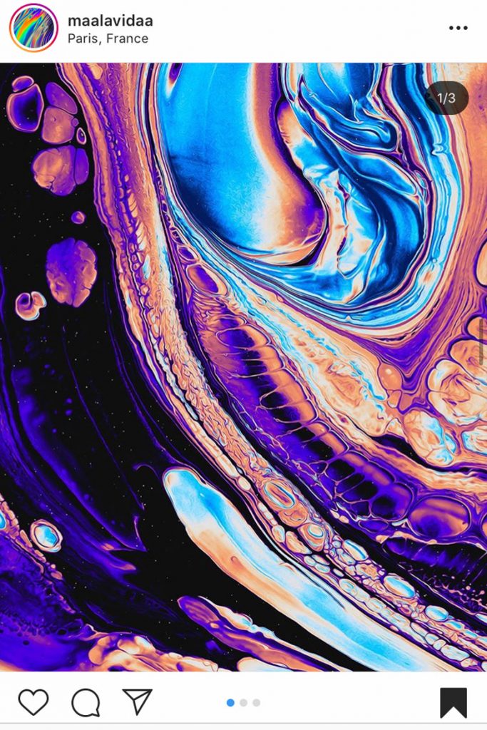
Instagram: @maalavidaa
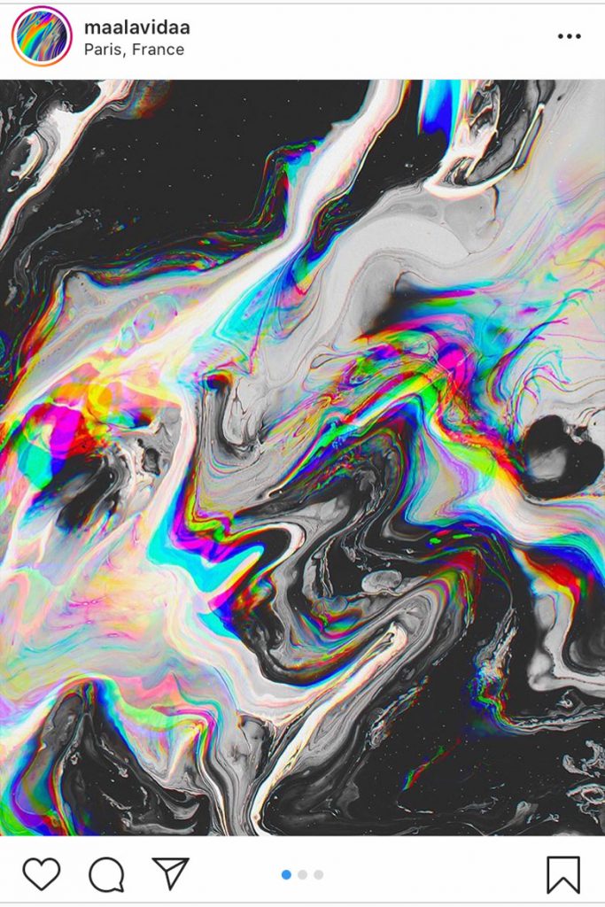
Instagram: @maalavidaa
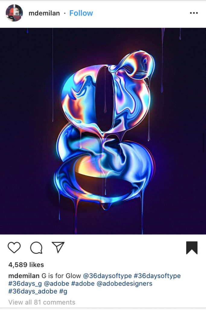
Instagram: @mdemilan
Parisian artist Alycia Rainaud creates abstract art of liquid forms threaded with bright neon tones over darker shades, playing with shape, form and texture, resulting in mesmerising and surreal pieces that are proving popular to her 150,000 followers on Instagram. The smooth and flowing lines are comforting, and almost calming despite the bright neon tones that are quite often jarring in its usual light form.
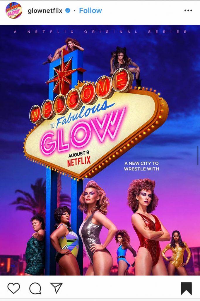
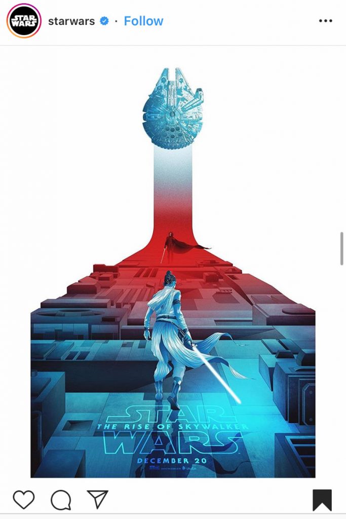
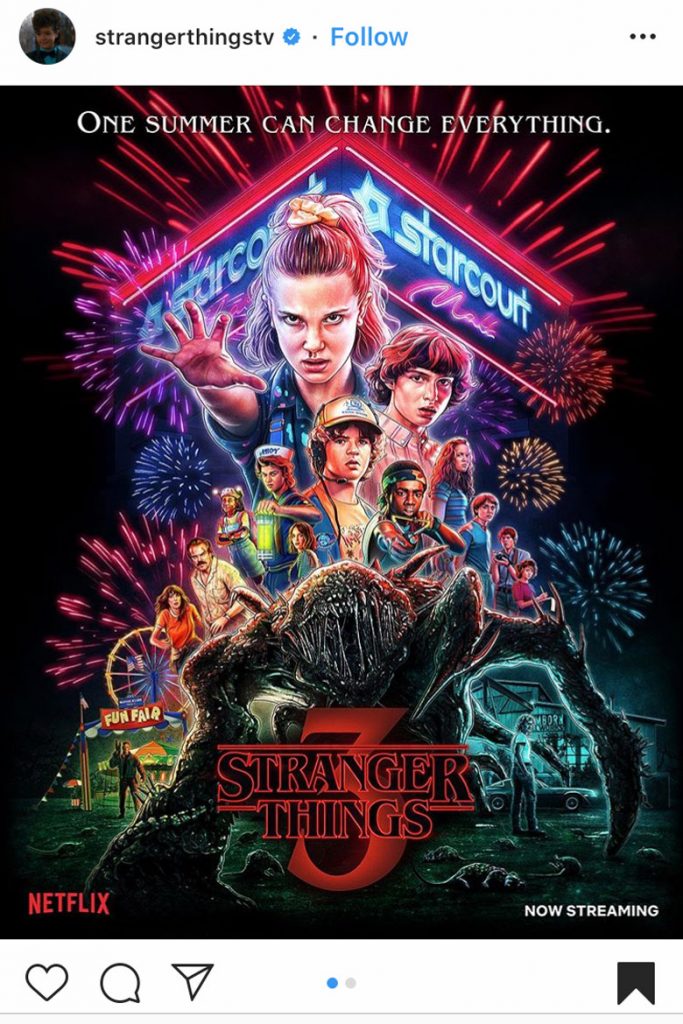
However, Pop Culture is where the neon light reigns king, with shows such as Stranger Things and Netflix’s GLOW making use of 80’s style neon lights and colour schemes for their promotional graphics. In the world of film Star Wars’ and Marvel’s extensive use of neon lights in the world outside of our galaxy has only emphasised the futuristic and other worldly use of striking neons, and this is set to continue with the ongoing parts of all the franchises.
Instagram: @17thandoak
Instagram: @17thandoak
Instagram: @17thandoak
GIFS/Continuous Animations
(Click on the post for the full-effect of these animated masterpieces)
In a day and age when attention span is dropping, and brands are increasingly engaging digitally, the age of the GIF continues. A quick and often fun and innovative way for brands and artists to engage with people, the immersive nature of GIFS and continuous animation sequences are more captivating than still images and it seems 2020 is the year of motion.
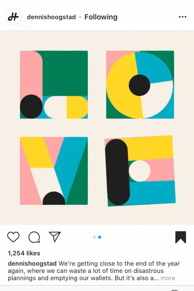
Merging animation with typography, Dutch artist Dennis Hoogstad has brought together simple shapes and calm colour palettes to create simple but clever animations in the most satisfying way. Our favourite so far is his imaginative take on that four-letter word we can’t escape, but his animation injects the play back into ‘love’ with funky letters bouncing and switching in a mesmerising way that is so immersive you could watch it on repeat all day. This is the exact unique beauty of the short-looped animation and the reason for its rise in the world of graphics. It’s simply entrancing and engages us in a way we’re not used to in the quick scrolling of feeds and endless refreshing. It seems sometimes all we need is a little animated love.
Instagram: @dennishoogstad
Instagram: @studiofeixen
Instagram: @odditystudio
Big Typography
It’s time for Typography to really take-over with the maximalist type trend continuing. Extravagant and often contrived letter forms, heavy fonts with words spread across the page not always in order, all making the eye work harder to find the word and increasing the impact. Semi-transparency and double fonts are also continuing into 2020 and putting more importance on the humble typeface than ever before.
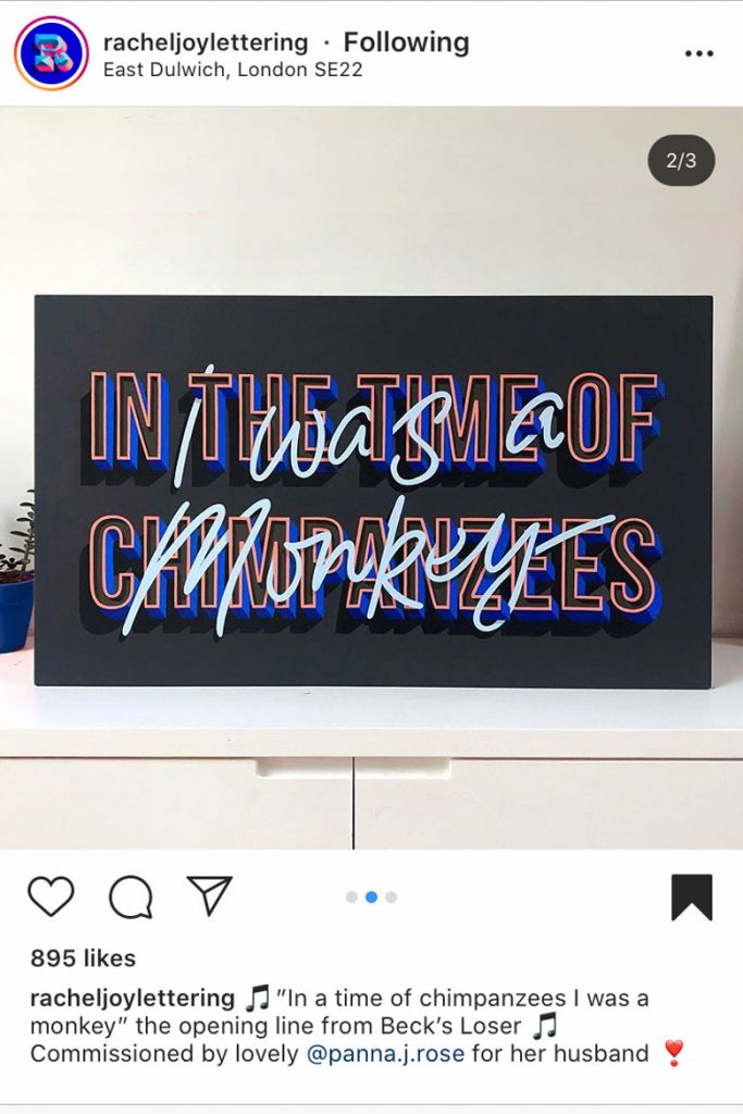
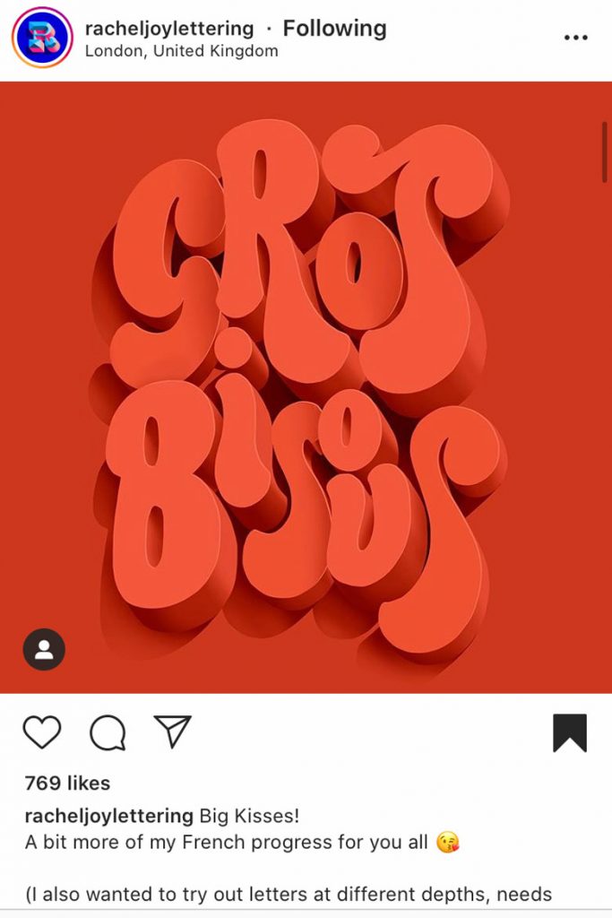
Artist Rachel Joy exemplifies some of the more fun sides of the maximalist type trend, with big bold letters in contrasting colours and a playful handwritten font weaving in and out of the layers emphasising the three-dimensional typography. Another monochromatic work of hers makes use of shape, form and three dimensional typography to create a modern and playful piece, full of the joyful feeling of ‘Gros Bisous!’ (Big kisses for the English folk reading)
Instagram: @racheljoylettering
Instagram: @racheljoylettering
Instagram: @mdemilan
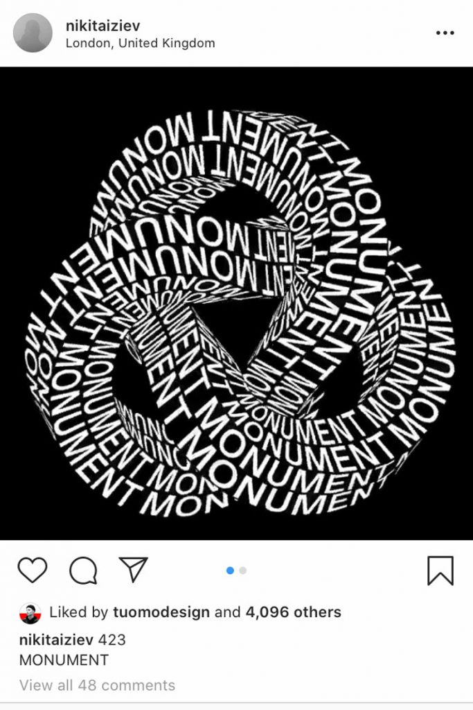
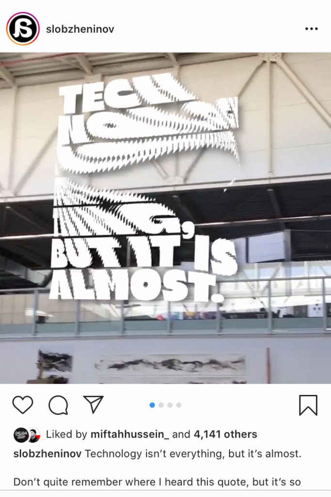
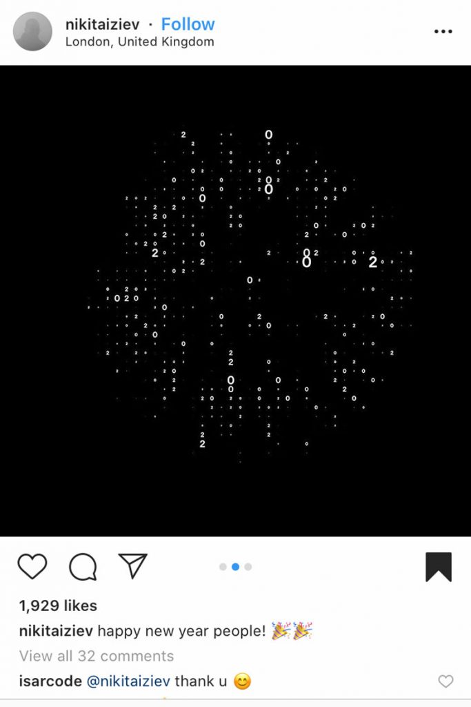
Kinetic Typography
This is an exciting advance in the world of typography with words becoming more than a collection of letters, with meaning conveyed through movement, shape and digital manipulation that plays with the eyes and forces us to see things through a different lens.
A great example is the work of artist Nikita Iziev, who has taken typography to new levels through the use of 3D, motion and a black and white palette that leaves all the impact to his creative talents. Designer Alex Slobzheninov has also used his flair for animated typography to create mind-boggling sequences – once layered over photographs in a dystopian fashion they showcase how the trend in Kinetic typography can be used with other medias to create art that tests the eye, the mind and the conscience.
Instagram: @nikitaiziev
Instagram: @slobzheninov
Instagram: @nikitaiziev
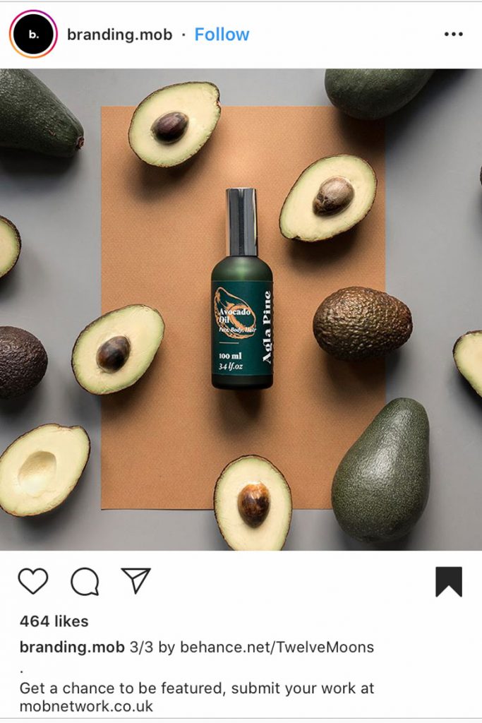
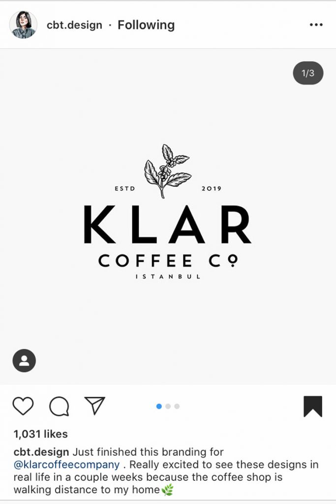
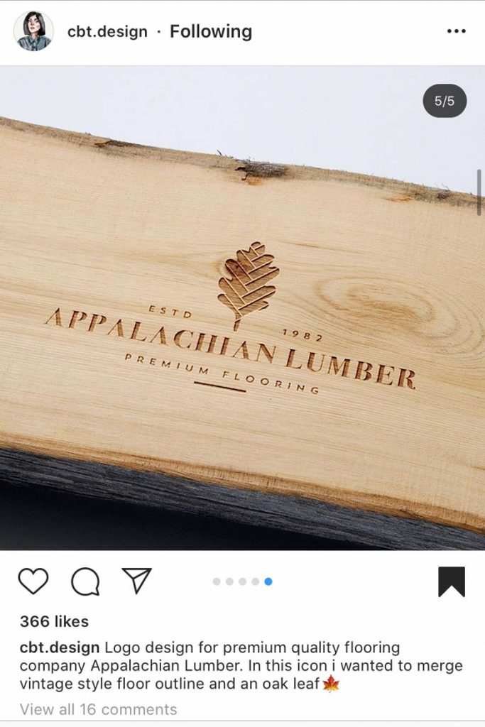
Humanizing/Organic
As sustainability, climate change and eating less meat is on the rise, caring about the planet is a key drive for artists and creatives too as we go into 2020. A yearning for the natural world in typography, illustrations and logos has picked up with people needing a calming and natural approach to their art in response to the concerns about the planet we live on.
Whether it’s using actual plants, fruits and vegetables in designs or just the muted earthy colour palette, as the wellbeing trend shows no sign of slowing down the idea something is naturally sourced or organic is more popular than ever.
Behance: TwelveMoons
Instagram: @cbt.design
Instagram: @cbt.design
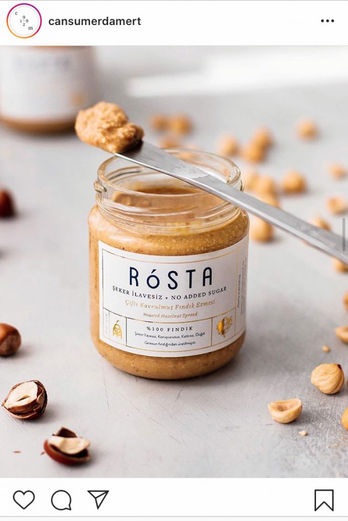
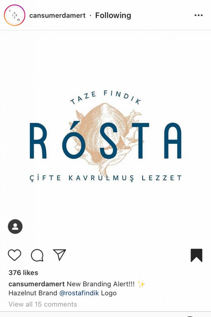
Artists who have a flair for the uncomplicated but beautiful illustrations inspired by nature, your time is now. With creatives such as Ceren Turkan bringing plant to page in logos that bring a warm and comforting earthy feel to coffee houses and flooring companies alike.
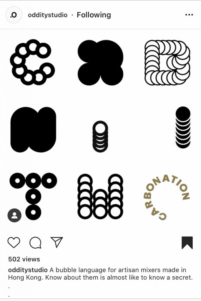
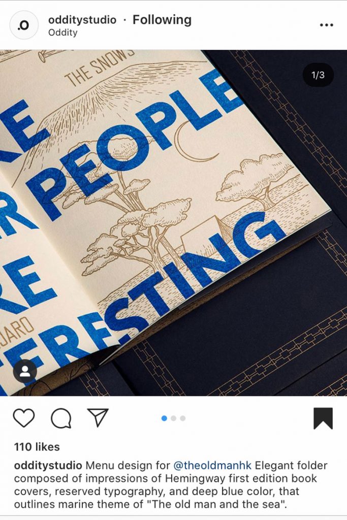
This is a trend that has naturally merged with that of metallic gold lines which bring class and a sophisticated edge to illustrations and branding work alike. The use of gold in contrast with bright blues and bold, simplistic typefaces such as in the work of Oddity Studio brings to mind blue skies, azure oceans and golden sun, a luxurious picture of a world that is the perfect antidote to the precarious planet we face today.
Instagram: @cansumerdamert
Instagram: @cansumerdamert
Instagram: @odditystudio
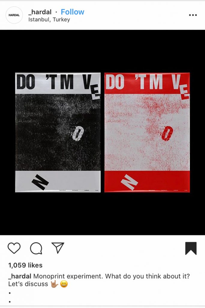
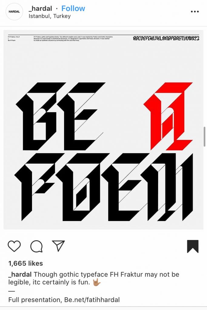
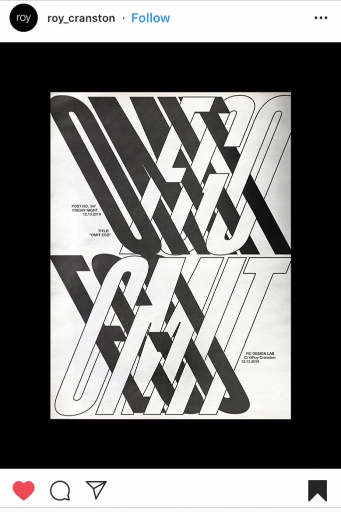
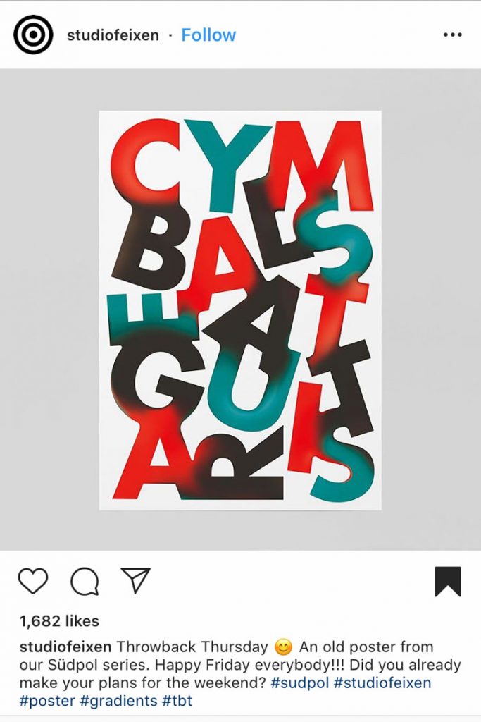
Intrigue and Graphical Disruption
Bringing back the ‘I don’t get it’ feeling of looking at art, but in a way that makes us want to understand, this trend comes with deformed letters, adaptive typography and disruptive typesetting. Compelling the viewer to stop and consider what they’re looking at is something that is near-impossible in a chaotic and fast-paced digital age, and the response to this is art that forces us to stop and look closer lest we be left completely baffled.
Instagram: @_hardal
Instagram: @_hardal
Instagram: @_hardal
However, it’s not only words artists are working to convey, but a feeling. Distorted typography can make us feel uncomfortable, we’re used to a certain order and throwing legibility out the window is throwing out the way we understand the world as it is. Artists such as Faith Hardal use almost indecipherable fonts and distorting techniques that add intrigue and depth to simple phrases, demanding we take our time to understand. In a world where time is precious and life unpredictable, taking a moment to decipher the chaos could be worth it.
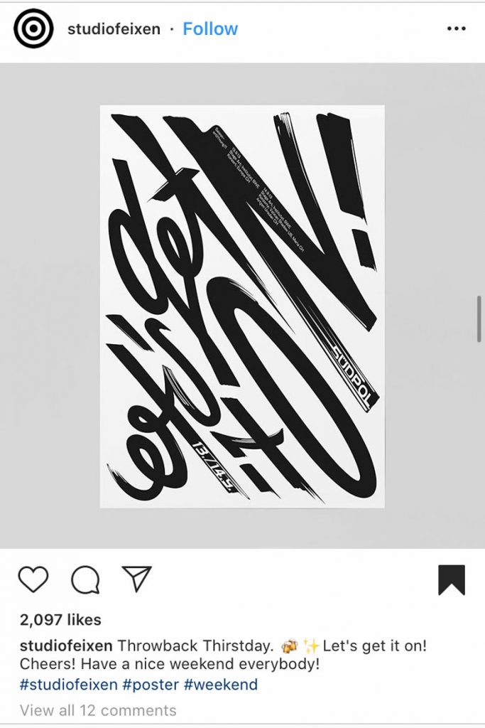
Another artist taking bold but simple typography and distortion to get his message across is Roy Cranston, Omit your Ego and have a closer look at this one. But it’s not all chaos and disarray, positive messages can be just as powerful in a distorted form, with the elusive ‘a-ha’ moment of understanding matched by that Friday feeling.
Instagram: @roy_cranston
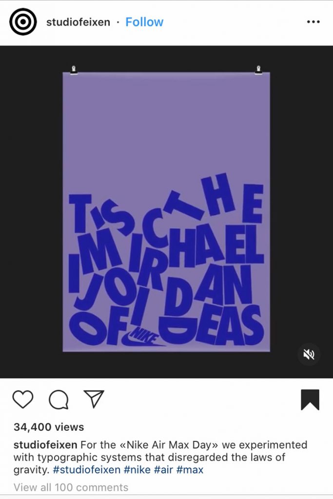
Instagram: @studiofeixen
Instagram: @studiofeixen
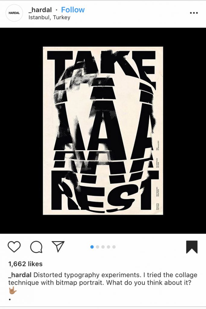
Collage
The art of the collage is a difficult one, but the space between a noteworthy digital collage and your mum’s ‘abstract composition’ of your family holiday to Tenerife is much larger than you would think. The merging of textures, typography, layers, colours and gradients to create a piece worth its salt is surprisingly time-consuming, with the attention to detail and level of creativity required only a gift of the few not the many.
It’s not only the mediums that are worked together but the sense of past and present are often intertwined to bring a previous time back to life through the eyes of the modern world, a complex portrait that unearths things that are often lost in the simplicity of contemporary design.
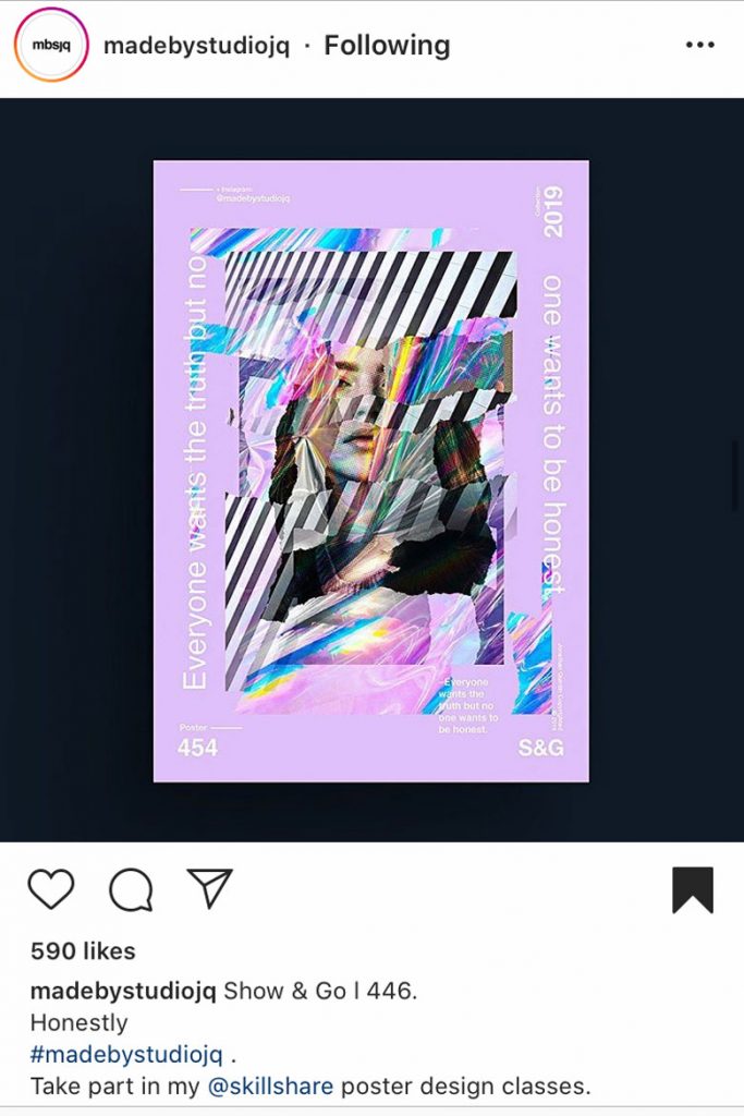
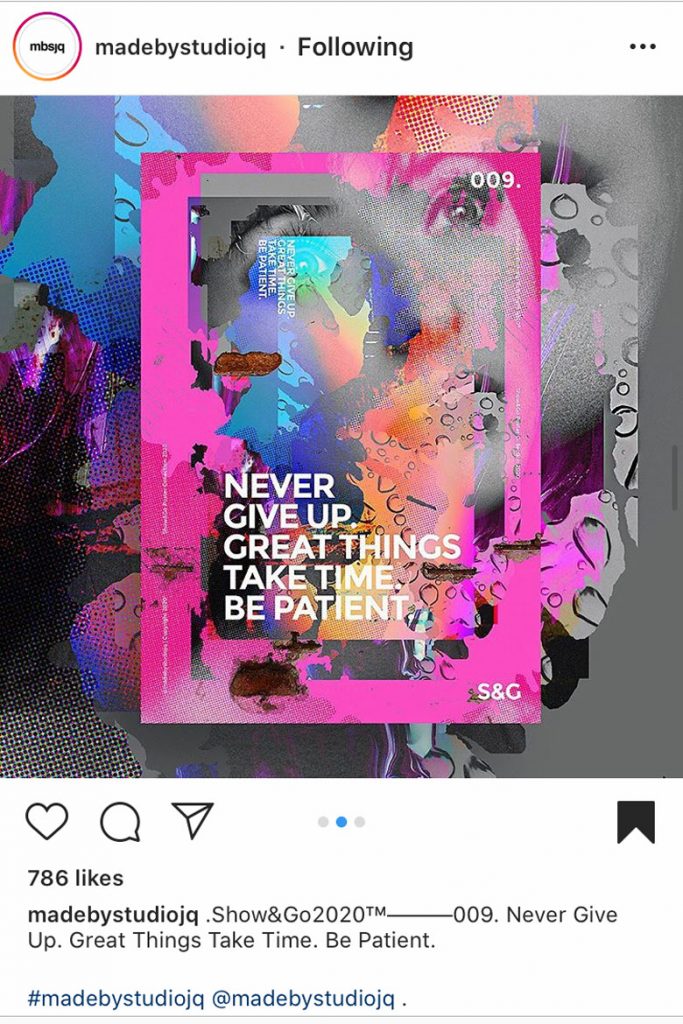
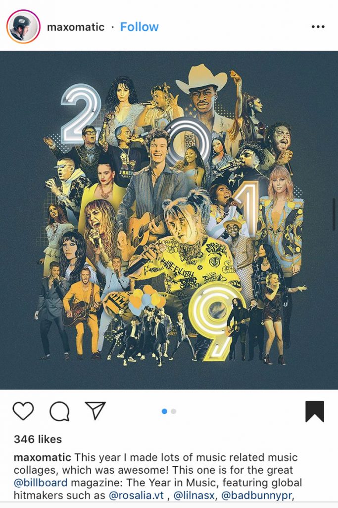
This is showcased best by artists such as Jon Quintin who creates compelling pieces full of contrasts with a depth achieved through the many layers he reworks, yet the overall result emerges harmonious and captivating. But it’s not only niche artists, it’s also a trend picked up on by big brands, with Billboard commissioning artist Max-o-matic to visually encapsulate the best of music in 2019, with a captivating mish-mash of artists, energy and iconic outfits that makes you want to look closer and see more.
Instagram: @madebystudiojq
Instagram: @madebystudiojq
Instagram: @maxomatic
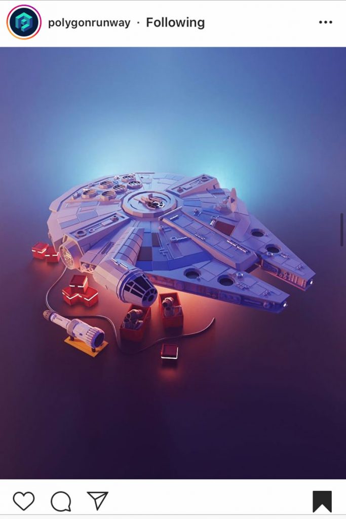
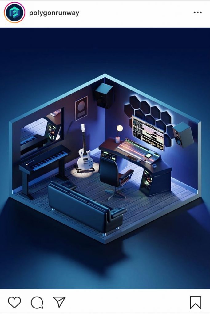
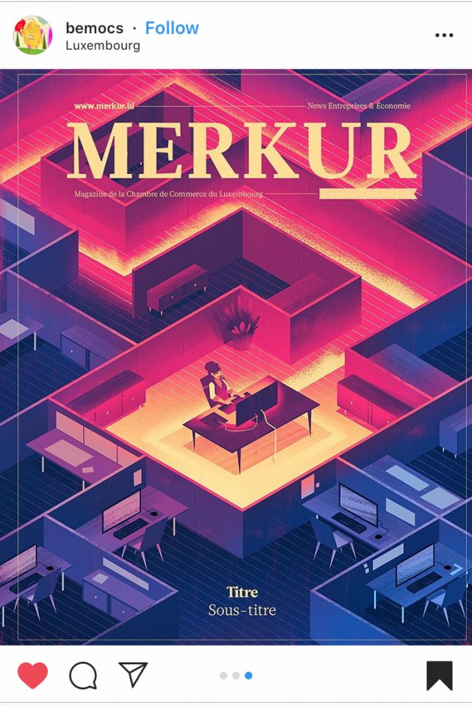
Isometric Illustrations
A medium that has grown in parallel to the advances in 3D software, isometric illustrations started out as a useful drawing technique for technical illustrators and engineers to depict 3D objects on 2D surfaces. However, they have evolved to become a staple of the creative world and an exciting trend in Graphic Design for 2020, with the influence of video games inspiring creatives to imagine worlds, characters and even reimagine the everyday from a new viewpoint.
Artist Roman, who goes by the name Polygon Runway, has mastered the art of isometric illustration to depict the everyday and the other-world in equally captivating scenes. From Star Wars to music studios, his mini-worlds are beautifully lit in gradients and neons, effortlessly combining another 2020 trend into his work that is set to take off this year.
Instagram: @polygonrunway
Instagram: @polygonrunway
Instagram: @bemocs
But it’s a trend becoming more popular not just digitally but in print too, Illustrator Brian Miller’s recent commission for the cover of Luxembourg’s Merkur Magazine on ‘attracting talent in the workplace’ shows how isometric design can be powerful in immersing the viewer into the art. The contrasting of colours and warmth of the fiery pink and yellows spark an interest with the viewer feeling as if they are looking in on the usually mundane but in a different light, breaking the sometimes-claustrophobic feel of the office to see it as open and connected. This kind of art is a trend that is only set to go as we search for different perspectives and new ways to look at the everyday.
Sustainability
It’s the age of sustainability, with artists and brands alike starting to take responsibility for their impact on the planet. There has been a rise in art on climate change and sustainability that is set to continue and rise in 2020.
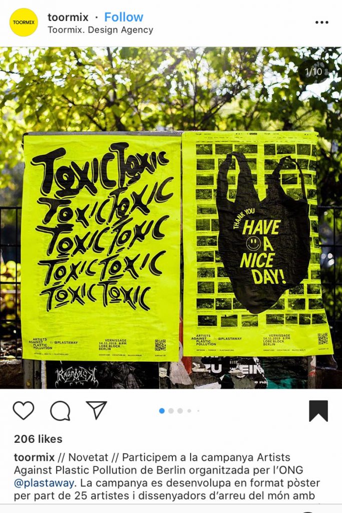
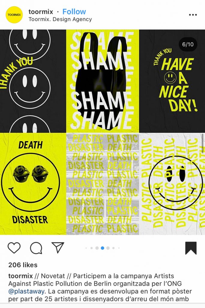
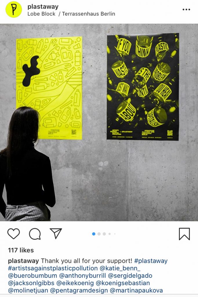
Groups of creatives fighting for good have often successfully commissioned good design to help their cause gain traction and raise funds, one such company is Berlin-based Plastaway who are fighting against single-use plastics and comissioned agency Toormix to create some graphics. Using a neon yellow background for their posters, the bold black typography takes centre stage to get their uncomplicated slogans across. The simplicity of the black and urgency of the yellow converge to create a clear call for action, and the sale of their vivid prints online raises money to fight the good fight.
Instagram: @toormix
Instagram: @toormix
Instagram: @plastaway
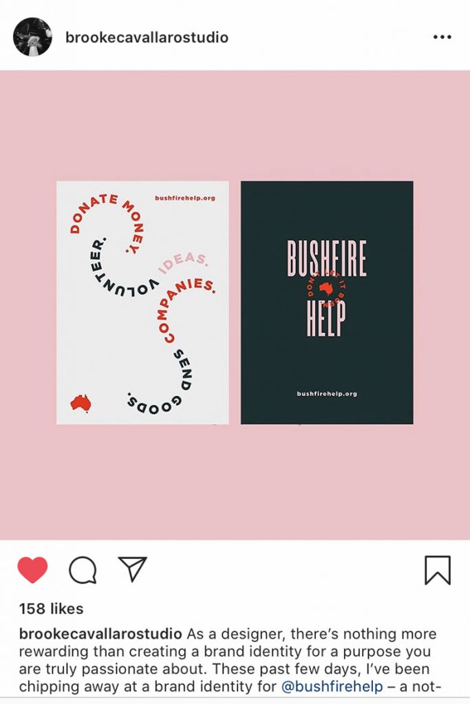
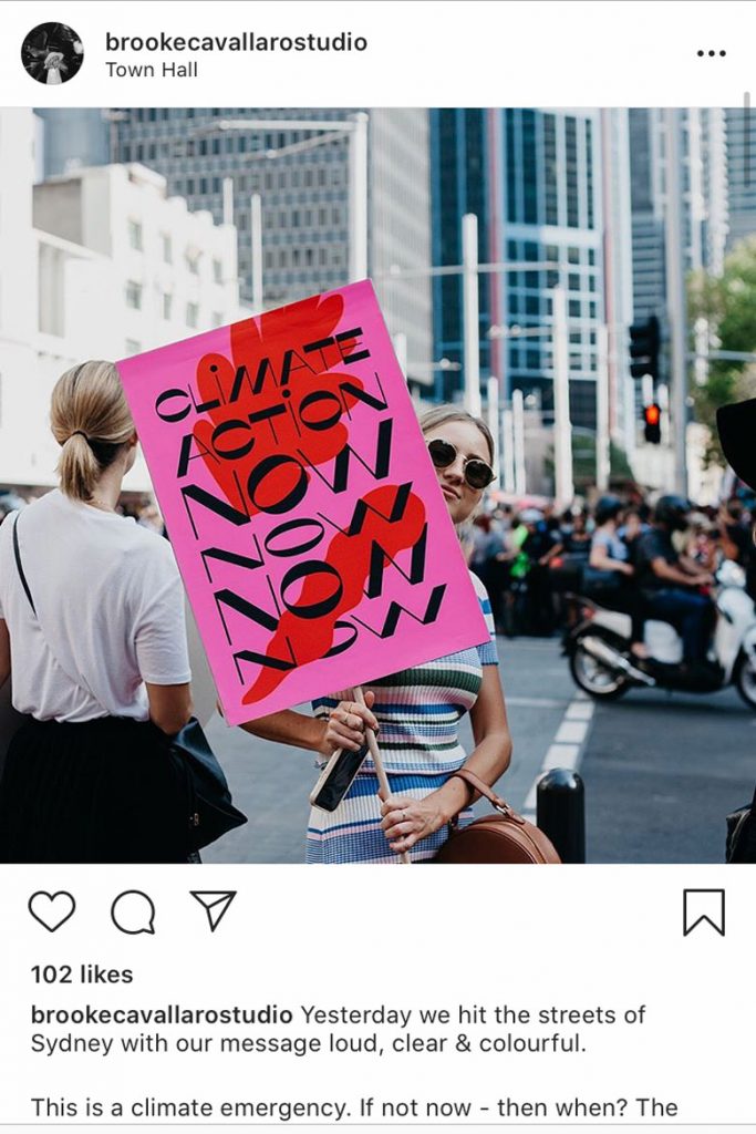
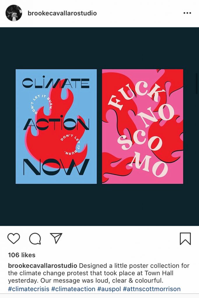
This approach has also been taken to Australia’s bushfire crisis, with Australian artist Brooke Cavallaros creating branding for not-for-profit organisation Bushfire Help. She uses a red icon of a burning Australia and shapes her typography to create intrigue and force you to look closer, encouraging us to take the same approach in looking beyond the raging fires to the root cause. Her placards on climate change take a more disruptive approach using bold analogous colours that immediately catch the eye and convey the urgency and protest-like nature of the cause.
Instagram: @brookecavallarostud
Instagram: @brookecavallarostud
Instagram: @brookecavallarostud
So, a few weeks in and it’s been a hectic year, but we can have hope it might get better. If the Instagram art and talented artists we’ve found are anything to go by then we’re in for a year of exciting developments. Art continues to make a huge impact on the life we live, whether it’s the movie posters on our wall, the magazines we read or the causes we support, and it’s an exciting time to be a creative. If there is anything we can learn from these trends as a whole however is that as the world around us changes, we’re learning to change with it and as unnerving unpredictability can be, it can create beautiful things too.